Wednesday, December 3, 2008

Render trees fast!

Ever wondered why opacity mapped multi-layered trees were slow in rendering when using GI? Well here is a quick workaround on getting those trees to render about 4 or 5 times faster with full GI.The image below shows an opacity mapped tree with standard Max materials and full GI and area shadows.The image below shows the same tree with the same material, but with filtering set to none in the opacity bitmap. The tree shows much more detail which I like a lot more as the image above
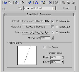
So setting filtering to none in the opacity bitmap does little to nothing with the render time.There is a material that handles opacity in a much faster way. Its the B2 Utility material. So to speed up the render we want to use that Utility material in combination with the leaves material. For this you should use the Blend material, set up the way that is shown in the image below.The Utility material is setup as shown on the image below. If the leave patches needs a double sided material then click the 2-sided option. Set the Trans color to pure white.The leaves material is the original leaves material but without the opacity bitmap, shown below.
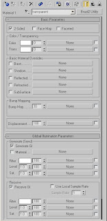
Finally we'll have to put the opacity bitmap in the Mask slot of the Blend Material. I've set the filtering to None.
If you hit render now it will render a lot faster.Have fun rendering....... faster......

edit: links to full size images now work....

edit2: In previous journeys of mine finding a faster render of that same tree I used to slap the whole material in a Utility material and then Use Local Sample Rate of 1.

So if you even want to speed things up more (ofcourse getting a lesser quality) you can put the blend material, or in my case a multi/sub, in a B2 Utility material and set that value to 1 as shown below.
Now the rendertime is even faster but at a cost of indirect shadows/light quality. This will work on trees far away from the camera though.

edit3: Pixel_Monkey found out that there was no GI in the tree, because of the way that the Blend material gets its properties from the sub-materials. So disabling the GI in the Utility material resulted in the whole Blend material not getting and sending any GI.

Rhino Tip - saving z-buffer data

This works differently than it does in the 3ds Max verion, and it just came up in the Rhino newsgroup, so I thought it was worth a mention here:

Question: Is there a way for Brazil to make an output of a depth map to use it with
DOF pro?

Answer: Once you've rendered, switch to "Z buffer" mode in the render window. You
can now press the "Save" button to save it.

Thursday, November 20, 2008

Brazil Materials DVD - From Gnomon


From Sebastien Chort (aka Zeb), and produced by Gnomon.

Here's some sample images [1][2], and some sample materials [1][2][3][4][5]!

I haven't seen the dvd yet, but it looks cool and it sounds like the included material library alone is well worth the cost -- 100 materials and 150 tileable textures.

.... And in other news: The BlurBeta plugins for 3ds Max 2009 are posted up at SplutterFish.com!!!

Friday, October 31, 2008

Happy Halloween from SplutterFish - BOO

Double, double toil and trouble; Fire burn, and cauldron bubble.

A new look at SplutterFish.com and 25% of off Brazil by using the coupon-code, "BOO" !

Also -- Free training videos from MentalBoutMax and SplutterFish, available here.

Monday, October 20, 2008

New Tutorial -- Render-Cache with Auto Occlusion


New Brazil tutorial From McNeel.com -- This one's Rhino specific, but the same principles apply to Brazil in 3ds Max. This well written tutorial does a nice high-level job of covering how Auto Occlusion works.

Friday, September 19, 2008

The Ghost of Ghost Challenge!

Remember "Ghost"? For those of you that maybe weren't here when all this GI and "production raytracing" in 3ds Max stuff really started, back in the year 2000, Ghost was the code name of the old pre-alpha versions of Brazil r/s -- Ghost was the first of this new breed of renderer on the scene, was freely available, and the images that 3ds Max artists were suddenly producing rocked the rendering world.

Now SplutterFish has launched an interesting new contest based on the technology level that Ghost was at back in those days.... with over 100 prizes, including $7500 in cash ($2500 Grand Prize!). Check out the rules, read about why we're doing this, and jump on in.

... And yes, you can use Rio :)

Monday, August 4, 2008

"bright needs dark to compliment it"

Another set of examples by Paul Sherstobitoff. [here]


I like the different environments that you can see in these images, and how they affect and compliment the different material setups.

Monday, July 21, 2008

Procedural Marble

This is a Brazil for Rhino tutorial, but it's got a great conceptual breakdown of the process Brazillian, Paul Sherstobitoff uses to create a really nice looking procedural marble: [here]

Thursday, July 17, 2008

Making Grass with Displacements in Brazil r/s

...What options do we currently have?
For those who are doing ArchViz in Brazil 2, this is a common question. I have seen some nice work using displaced grasses in other renders, so I decided to spend some time exploring different techniques for getting similar results using the currently available versions of Brazil.

Within Brazil r/s, there are two different ways to make displaced grass:

  • First approach: Use B2 primitives (sphere & plane), which have good looking, reliable displacements built-in.


Benefits: fast, no errors, nicely looking
Drawbacks: only works on sphere and plane geometry
  • Second Approach: Use B2 displacement modifier and apply it to any arbitrary geometry.


    Benefits: arbitrary surfaces, more control
    Drawbacks: Beta feature, thus not finished and prone to bugs when combined with various other features.

My displacement settings
Currently I build 2 basic types of grass via B2 displacement.
  1. English lawn


    Settings are pretty simple :) I have used my material from the SF Material library - Grass V1. Apply to an object of your choice. Using the mapping modifier, scale the map to see all the small noise of the displacement map. Add the B2 displacement modifier: Analytic, ammout to match your scene dimensions, displacement map instanced from Grass V1 diffusion slot (this helps me to see map size in viewport) , 1.0 max error. Scene file linked here with materials and textures.

    test_scene.zip
    (VIZ2008/ Brazil V2 pro beta build 1619)

    In the screen-shot below, you can see my settings and the rendered frame.


    Render-time: 17 minutes (1-core) isn't great but at least it works:) I have a lot of "hungry" (processor intensive) settings still switched on. Take this scene, tweak the settings, and see what you can do to speed things up and make some observations on how things work together.
    Tip: This is a "beta" feature, so use it carefully, and avoid of rendering with auto-occlusion or retrace on.

  2. Wild grass


    This grass is created with the same procedure as the English lawn. The only real difference is in the mapping. I use different sizes of mapping over the whole surface. The variation in the mapping is shown in the picture bellow. In addition to varying the size, I also add a some slight noise to the texture.


  3. Recent Results:


    The lawn in this scene is a combination of both the above mentioned techniques (1. and 2.). The grass was rendered as a separate pass and composited together into the final frame. I have used min/max sample settings of 0/1, which made the grass to look coarser and more realistic (also, this drops the render times considerably).

Other approaches and examples
Here's some other techniques that you might find handy...
  • Hair and fur

    Benefits: built-in MAX feature, render effect, animatable
    Drawbacks: difficult to setup it

  • ornatrix and hairFX

    Benefits: lot of profi tools, nice results, animatable
    Drawbacks: commercial plug-in

  • scatter - geometry

    Benefits: looks realistic, built-in standard MAX feature (scatter)
    Drawbacks: generates huge amounts of geometry


  • scatter - opacity mapped

    Benefits: looks realistic, built-in standard MAX feature (scatter)
    Drawbacks: generates huge amounts of geometry

  • grass-o-matic

    Benefits: easy to setup, nice results, great for foreground
    Drawbacks: lots of geometry

  • Pflow grass

    Benefits: N/A
    Drawbacks: N/A

  • GrowFX

    Benefits: N/A
    Drawbacks: N/A

  • 2D composite grass

    Benefits: realistic look
    Drawbacks: 2D technique, stills only

  • Your tips?

Conclusion:
I will check for your comments -- If you find something better or any improvements, please let me know and I will add it here. I hope this short tutorial proves beneficial and I'm looking forward to seeing your works and advice :)


contributed by Pavel Romsy

Wednesday, July 16, 2008

Aren't computers cool?

Here's an image rendered by David Rutten in Brazil for Rhino:

"A little trick, the geometry looks fine in reflection and casts proper shadows. Only Primary Camera rays have been fooled."
Too cool not to share.

Next: building grass with B2 displacements

Tuesday, July 8, 2008

Brazil "Rio" video tutorial

Here's a new video tutorial posted by fellow blogsite: Mental 'Bout Max. It's only covering reflection in the B2 Advanced Material, but it has a nice conceptual overview of that strange "Kr" in there :)

Thursday, May 29, 2008

Brazil r/s "Rio" - Available Now!


The free-for-use version of Brazil r/s, aka "Rio" is finally here!

The big differences between this and the previous versions of Rio is that this is based on Brazil r/s V2.x's Pro-Beta version, and is less "limited" than the previous Rio: In this one, the res limit has been increased and the EULA doesn't say non-commercial-use-only anymore.

Rio will work for trying or sharing materials from the Brazil Material Gallery. Tutorials done here will work in Rio, but if the tutorial was done in a non-rio version, the scene is effectively read-only, so you won't be able to re-save the scene (saving images works). We'll do some tutorials with Rio here, so that re-saving won't be a problem for anyone. See the Release Notes for all the details. Enjoy!

Wednesday, May 14, 2008

Rhino Beta -- last chance?

Here's something from the rumor-mill: It's looking like beta testing (free to registered rhino 4 users) may be nearing completion, so now might be the time to get a look at it, in a near complete state, before McNeel and co. close the beta!

Wednesday, April 23, 2008

DomeLight vs. SkyLight

"[Dome light] does have a slightly different look to the skylight and I was wondering what the difference was, as on the surface they seem to be doing the same thing."
The main difference is usually the use of the Render Cache. The DomeLight does not work with the Render Cache yet, which Sky Light does. As the Render Cache tends to blend the samples together over a greater area, that's usually the main difference.

( Note: rendertimes are for a Pentium Mobile 1.6M - divide by 8 for modern systems )

Assuming you're not using the Render Cache, however, then the next biggest difference is in the DomeLight sampling the 'sky' much more efficiently, especially with high-contrast sky maps, such as HDR maps. If you have a map with mostly blue sky and one very bright sun, then Sky Light is going to have a very hard time resolving that into a clean lighting solution for the scene. The Dome Light, however, recognizes that there's a bright sun in the map and will focus its attention on that. So while Sky Light might give you mostly blue (sky) lighting with noisy yellow spots here and there from where it randomly did hit that sun, the Dome Light will give a nice even lighting and crisp shadows.

If you let both run for long enough, though (mostly Sky Light - DomeLight calculates in no time as it is), they should give the same result.


That said... just as Sky Light is imperfect because it only samples the sky randomly and is prone to missing bits with some regularity, DomeLight is imperfect because in its determination of which bits of the sky are the most important it, by definition, makes other bits less important. Although that does wonders for speed and overall accuracy, you might see some minor variation from a pure Sky Light calculation. Typically, however, it's well worth the speed gains.


by Richard Annema

Tuesday, April 8, 2008

Brazil 2 "Linear Workflow" in zero words or less.

I just saw this on the SplutterFish forums and got a kick out of it. Image courtesy of zemmuone. :)

Monday, March 31, 2008

Resin Domed Decals in Brazil r/s V2

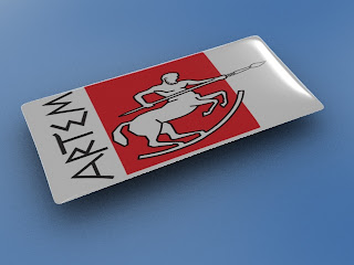
A friend of mine asked me if I could make a "resin dome" type sticker in 3d. The picture below is an example of the kind of sticker I want to create.

Here is start scene made in 3ds MAX8. *start.max*

Start scene

  • If you open it, you should see a simple scene with a camera and 2 objects. The top of the object is made from a loft, as I wanted to have a control over shape of the sticker, converted to the editable mesh.

  • If you hit render you will get all black because all the lights are switched of by default.

Basic lighting

  1. Start by adding overall light via basic skylight (min/max aa set to 0/1 to give us some aa and Sky light rate set to 5 for fast preview renders). Render again and the result shows a rectangle with round corners lit with the skylight color.

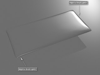
  2. Now start adding highlights from additional lights. First unhide Brazil Light01 (I have hidden all the additional objects in this scene to make following along easier) with settings like those in the picture below. This light adds a strong specular highlight to the right side of the sticker (also notice that this light is set up to affects Specular only).

  3. Unhide the last light (Brazil Light02) which adds a specular highlight to the lower left corner. Now, also unhide the ground object.

Click Render, and look at what we have: Our "Sticker" is flying above the ground plane. This is so that we can add some shadow effects in the future. The lighting looks good for now, so next we'll add some materials to the scene.


Materials setup
  1. Ground plane material: Add a new Brazil Advanced material to the material editor. Set the specular level to 0 and add a noise map into the color (CS) slot. The Noise setting are on shown on the picture below. I wanted only slight gradients.

  2. Sticker top material: Make a material that simulates resin.
    Now adjust the reflection, transparency and other settings to match those in the picture below. Glossy reflections adds nice light blur to all reflections and this effect will make the render more handsome. If the render time on your computer slows down too much, turn the glossy reflections off (for now) and re-enable them again at the end of this turtorial.

  3. Sticker bottom material: Another simple material. Look at the screen-cap below to see what settings we've used. Everything has been left at it's defaults except that we've reduced the specular. We don´t want to bottom part to have any highlights. And also add some picture or logo of your choice. Don´t forget to make this material 2-sided.

And render. Render time on my computer was 38s (640x480). But image looks pretty flat since the environment has nothing interesting going on. So lets add an HDRI environment in the next step.


Applying HDRI map

Now we'll add an HDRI map to spice up the environment and the reflections in the resin. For this tutorial I have used *living_day.hdr* from www.aversis.be (It´s free to download).
  1. Load HDRI into enviroment.

  2. Load HDRI into skylight.

  3. Change the HDRI values. Render image.


    The render time is longer than it was previously (58s), but the image looks much better now. The lighting and reflections on surface has been improved.

Now modify the HDRI setings as shown on the picture below and render again.


Additional reflections

In this part we will try to add some additional reflections to the surface to make the image a bit more interesting. On the picture below I've shown where I want them.

  1. We will reflect some simple geometry with a bright white material on it. Unhide the remaining hidden geometry in the scene (bigwhite and blinds group) and apply a new material to them (details in next step). The scene should look like this:

  2. The material we want is shown in picture below. It is simple white self ilumination material.
    One note.. if your Brazil r/s v2 Advanced Material highlight settings are all 0 (zero), you could change the highlight shader to 'None', which will have the same effect and be slightly (not really noticeably) faster.

  3. Render.

    Render time 1m13s but the scene looks a bit dark.
Go to the HDRI settings and change the white-point a little bit, (my settings are shown in picture below) and render again.


The lighting looks better now and we can start to prepare the final image settings.

Final image settings
  1. Set higher rate for GI and render.


  2. The render time has increased to 5m48s but there is much less noise now. You can continue raising the rate numbers at the cost of render times, or use the render cache which will gain fast renders with noise reduction. My render-cache tweaks are shown below:


  3. Render time has dropped back down to a minute and it looks like we're all done. We'll raise the sampling rates a bit more and tweak some more values in render cache, all shown on the screen-cap below. Render.


  4. Our render time is back up to 3m 20s. As I was hoping for a render time under 2 minutes, we have to change some settings a bit. I disabled auto-oclusion. Render.


Result

Render time: 1m 55s. This is pretty much the quality level I was looking for and the flexibility of the new tools in Brazil 2 has allowed me to reach my desired render time. There is a lot of room for experimentation (for example, different HDRI maps can have a huge effect on the picture). I have done some versions with different HDR's and textures below. Have fun and experiment -- try anything.

I hope that you have enjoyed this tutorial and please excuse me if there are some mistakes:) I expect others out there can find even better settings -- if so, please share :)

The final scene can be downloaded here.

contributed by Pavel Romsy