This tutorial is designed to give you a quick overview of the basics of setting up your first Brazil render. I'm not going to go into too much of the fancy stuff. You'll need to become familiar with these basic steps in order to do ANY Brazil rendering so just stick to the tutorial and in the end you should understand the "basic" work-flow of Brazil.
I think once you understand the concepts you won't find Brazil hard to use at all. Of course everything has a learning curve and if you've just started using Brazil r/s you're in the right place.
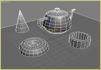
First off we create a generic scene. It can be anything you like. You can even work with an existing scene that you've created before. However, keep in mind that for the sake of speed in this tutorial you may want to limit the amount of geometry and texture.
As you can see my scene is VERY simple. I just put in a few rough primitives since we'll be focusing mostly on getting that look that is probably what attracted you to Brazil as a render engine. The fancy lighting etc...
Well the first part was obvious; you need a scene to work with.
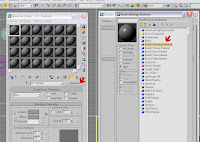
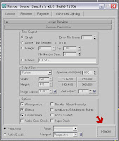
Next we click the "Render Scene Dialog" button. This will bring up the standard render dialog. Click the tab labeled "Common." This is where you choose what renderer you'd like to use. We're going to choose "Brazil r/s v2.0 [build xxxx] "xxxx" representing the build number but that's not too important since that build number changes all the time. The important thing is that you are using Brazil v2.
Click the three little dots "..." next to the "Production" render slot and you'll see the next dialog.
Once you've highlighted Brazil v2 click "OK."
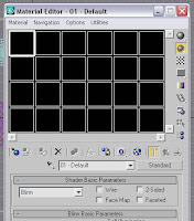
Obviously a bunch of black squares is not what we're looking for but by ticking the "lock" button to unlocked position we see the material editor below in all its glory.
Now that we have Brazil setup as our renderer and we have our material set to something fairly neutral we can simply click the Quick Render button and see what we have so far.

If you still have the renderer dialog open you can also hit the render button at the bottom. This is usually where you'll be clicking since you'll most likely make some tweaks as you go to get things just right. For now though you don't really have to worry about it. As you progress in skill though my guess is that you'll be back to this button frequently so if you want to get used to using it now then be my guest.
Well a few seconds later and we have what we see here. Gotta say... nothing too fancy but it is a Brazil render so you've made some progress. Now we just have to do a few simple steps and we can upgrade the look of this dramatically.
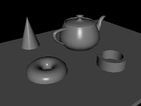
Obviously there are no real shadows other than the default light from Max which kinda sucks. We'd much rather use a Brazil Light right!? Of course! So click on the "light" button on your create panel.
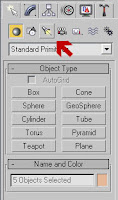
In the drop-down menu pick Brazil r/s v2 light.

Here I select an area light in the dropdown menu.

Features: While there are a ton of "features" for lighting I'm only going to do the most basic one that pretty much everyone will want to use and that is "shadow" so under "features" click shadow.

If you'd like you can click "Focus" and see a visual indicator of where the light is going to fall upon your scene. This makes it very easy to move your lights around to get them in just the right position.

Now lets pop off another render.

OK it looks a little better... we have shadows now but probably still not exactly what you were expecting. So lets go back to the "Render Scene Dialog."

From here we're going to up the sample rate in order to get rid of the little jaggies on the edges of our objects. This is called "anti-aliasing" or AA. Without going into too much detail about sampling I'm just going to say that for getting a scene setup just leave it at 0,0 and when you want to pop off more final examples up it a bit. Most of my high res images never go above 1,3. They usually look pretty good and serve most of my purposes.
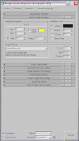
Now our scene looks a little more crisp but it lacks that nice ambient look. We've all heard about Photons and Global Illumination. It's basically the ambient light that cascades around a scene from light bouncing around just a bit here and there. But it adds a great sense of realism to the scene.
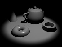
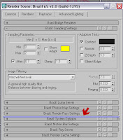
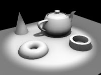
Oh I almost distracted you with the cool tip. HIT RENDER QUICK! Oh wow look at that you have skylight in your scene now. Doesn't that look a ton better?
Well since not all light is bright white the smart guys at Splutterfish have designed the skylight so you can make actual sky colors. As you can see below I'm changing the color of the skylight in the luma server rollout to something more realistic.
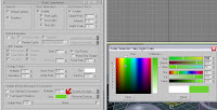
OK it might be realistic if everything was radioactive but you get the point. I'm just having fun and so should you. Playing with these basic settings is how most of the experts here learned how to make you green with envy at their skills. (intentional lame pun alert!)
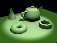
Anyway, it doesn't have to be green you can make it a sky color or even use an image to make the light... that's more Hollywood style goodies for later. Remember you're just getting the basics down so don't fiddle around too much with these little teasers I'm throwing out or you'll over look all the really important stuff.

Well the image looks OK (for a green room) but I want this thing to be a lot bigger so lets go back to the "common" tab on the "Render Dialog Screen" and set up a larger image. There are preset standard sizes that are often used in video, web, etc and you can also make custom sizes here.
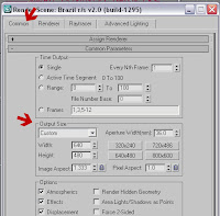
Then again, click the render button... see I told you the more you tweak the more you'll use the render button inside the "Render Dialog"

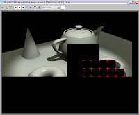
This is what it might look like if you have multiple processors or dual or quad core processors. This is called "Bucket Rendering" each little square is a processor churning away trying to process all the hard stuff you've been telling it to do. So as you up your samples, geometry, and lighting situation these renders will take longer and longer. You've probaly already noticed that just by rendering the first few tests. There are ways to speed things up but we'll have a tutorial on speed later. First we've got to get you rendering some images and saving them out to show to your friends and co-workers what cool stuff you can do.
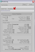
So the more complex the render the longer it'll take this little line to get across the screen. It's not much fun to watch so if you have to pee and you're on a slow machine do it now.
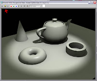
Finally we have something that looks more normal than a radioactive tea and doughnut party so lets save it! Look for the red arrow on this screen cap which shows the little icon that looks like a floppy disk. This is how you save from the VFB or (Virtual Frame Buffer). See now you even know some lingo... :)
From there you'll have a multitude of choices to pick from. Jpg is good for the web while tga is good for games and tif is good for print. But don't let me be the one to tell you which is best. Cause that is about like saying "what makes good art?" Everyone has their own opinion. Use your own :)
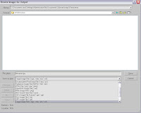
Alternatively if you don't feel like waiting around because you know you've setup a huge scene with lots of polygons and lights and fancy materials you can opt to save an output file in any of those formats and just walk away. When you come back your file will be saved where you told it to go. Sometimes the urge to watch a render is akin to crack addiction but please try to avoid the urge to watch a 45 minute render... do it this way. Life is too precious to lose so many to render hypnosis.


