My apologies for the lack of posts lately -- been very busy w/ work and life (we're preparing the release candidate, and... finally.. a website for Brazil materials :) ).
As for what's coming next on the blog: I've got 2 tutorials that have been contributed, which just need some editing and reformatting, as well as the interior tutorial mentioned previously, and more chapters for the field guide outline. I've also gotten some requests for some comparisons between Brazil 1 and 2, so I'm thinking about some good ways to show that.
Here's a couple images from the two contributed tuts:

Friday, September 28, 2007
Friday Diversons: (lame excuse version)
Posted by
Captain Video!
at
5:24 PM
![]()
Labels: Diversions, Excuses
Friday, September 14, 2007
Friday Diversions: Toonage
I really love the toon renderer in Brazil r/s -- Invariably, whenever I'm just messing around with Brazil r/s, I find my work drifting into experiments with NPR and toon renderings.
I'm a long time fan of cartoons of all kinds and love the different styles that have developed with different cartoons/comics/illustration/etc. Our original cartoon shader development was done for a game called "Looney Tunes Racing." Here's a couple of screencaps of characters from the in-game cinematics:
The type of toon shading required for this job was pretty minimal, with very little use of what we call, "multi-level paint" and very simple, non-weighted line-work. Loony Tunes did do more complex styles too, but the bread and butter of the work produced was kept simple and designed to be done quickly and to be outsourced as much as possible.
By continuing development of the Ink & Paint shader (which now ships in 3ds max) into what is now "Brazil Toon", we have continued to add more and more features and controls in an attempt to mimic the types of things that we were discovering in the design of various cartoons. Eventually, it kind of turned into a game to take a real cartoon and see how close we could get to the original style. So for today's diversion, I'll share some of those:
This image shows an anime background plate with a 3d character (courtesy of Rune Spaans) rendered over top. Note the day-for-night lighting, the decoupled shadowed/lit colors on the character's skin and the matching of the style of the line-work as well as the various colors of the line-work. Total setup time on this character was about 5 minutes.
Here again is Rune's character rendered over top of an anime background plate. This time the character has 3 level paint falloff, highlights on the skin, and gradients in the some of the ink-work. Here Dagan Potter does explodingdog's Red Robot with solid, simple colors, and a stylized, hand drawn look to the inking.
 In this, I wanted to play around with something like Frank Miller's Sin City graphic novels: White shadows in black environments, shocking use of colors, very bold and stylistic linework.
 Here's an architectural watercolor effect achived with a combination of in-render effects using blurbeta plugins, Gooch shaded Brazil Toon, and some post work for the paper texture. The model is by Aris Vidalis .
 Gooch shading and transparent Brazil Toon rendered side by side with a line-work only version of a technical illustration (background passthrough mode). The shading and rendering on this image was done by Robert Boothman.
  This image demonstrates the ink control that can be used to achieve highly stylized looks. These objects are rendering in background passthrough mode so that the background paper image shows through.
Model by Daniel Martinez Lara. The image uses Multilevel Paint in combination with volumetrics, complex lighting/shadowing, and post render effects on a large format frame (original render is 2k). This image shows off some more advantages of working with a hybrid in-render/shader approach - you can easity combine 2d and 3d elements, speeding workflow and gaining complex environmental interactions with minimal effort.
P.S. also check out the images on the Blur Studio/Spongebob Squarepants Artist Spotlight
Posted by
Captain Video!
at
2:02 PM
![]()
Labels: Diversions
Thursday, September 13, 2007
Tutorial: Control Reflections
This simple tutorial will show you one of the ways to control what is reflected in your scene. Download the file field-guide_reflection_tut.zip. Open the max file. We see a simple building and some kind of public art teapot sculpture. Render the camera view.
The windows are a Brazil 2 Chrome material and we can see they are reflecting the ground plane and a white environment. (Check out the Infinite Ground Plane tutorial for info on how to set up the ground.)
Let’s put a photo of some clouds in the background. Press 8 to bring up the Environment and Effects dialog. Load sky.png into the Environment Map slot. Open the Material Editor and drag the environment map into an empty slot.
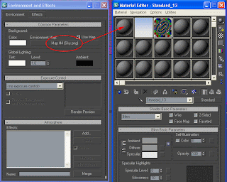 Choose Instance on the dialog box that pops up when you release the mouse. Change the Mapping Coordinates to Cylindrical Environment.
 Render again and you get this:
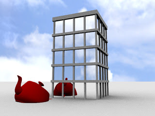
Now let’s change the background but keep the clouds reflected in the windows. Open the Environment dialog again. From the Material Editor, drag the blue gradient onto the Environment Map button and choose Instance. Render again.
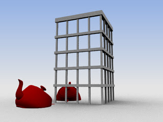
The clouds aren’t in the windows anymore but we’ll fix that now. Select the Chrome material in the Material Editor and go to the Chrome Parameters rollout.
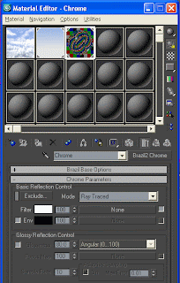
Click the checkbox next to Env to activate Environment mapping. Drag the clouds bitmap into the Environment map button. Now the chrome material will reflect the cloud graphic. Render again.
Lookin’ good! But what if you don’t want to see the giant red teapot reflected in the windows? Select the teapot, right-click in the viewport and click on Object Properties.
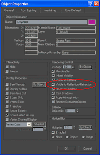
Uncheck Visible to Reflection/Refraction, click OK and render again.
This is just one of several ways to control what is reflected in your materials. The Environment map controls that we used in this tutorial aren't limited to the Chrome material. The Brazil 2 Advanced material and Glass material also have these controls.Thursday, September 6, 2007
Tutorial: Neon Tubing with Object Lights
Assignment
Come up with a setup for doing Neon Tubing -- complete with the proper look of the neon object itself, and it's illumination.
Observations:
We're all pretty familiar with what neon lights look like -- self-illuminated tubes of glowing color. Different colors and different effects are created with different types of gases and tubing.
A quick look at a google image search for "neon" provides some good examples and gives us an idea of the variety of looks that neon can have.
The colors are bright but generally pretty flat in terms of how they falloff at the edges of the tube, but in some cases you see an interesting gradient that's a lighter color in the center of the tube and a more saturated tone at the edges.
photos: Chris Higgins, Pslawinski & Wikipedia
Breakdown:
Overall look/feel: We'll go for an urban, neon bar-sign type of look. The environment will be dark to show off the neon.Surface: Not much detail except for the example on the far right which definitely has a glass look to it. We'll do a couple examples without the glass look (just straight bright objects), and then we'll do one with the neon-in-glass.
Camera: Nothing fancy about the camera. Standard lens, night shot.
Initial thoughts/plans: I'll just use a simple self illuminated renderable spline of a SplutterFish logo against a brick wall. For the lighting I may or may not use a dim key-light, but I will definitely use ambient occlusion (skylight) to get a nighttime look, and we will be using GI to allow the renderable spline to generate illumination. For the basic neon tubing a Utility material will probably be perfect, giving me simple colors and control of the illumination. As we try different looks, we will be using our trusty Falloff map for the coloring and we'll end up using Brazil 2 glass to construct a neon-in-glass look.
Execution:
As usual, the following is a step-by-step of what I came up with to achieve this. Do a quick render test between steps to see how things are progressing. Also, go "off-script" and do some experimentation of your own -- try different settings and different materials and see what kind of results you get. The files for this tutorial can be downloaded here (3ds Max 5).
- Setup
- File|Open... field-guide_neon_start.max
- Open the render dialog - assign Brazil 2 -- turn off the material editor lock, and turn off the "Rendered Frame Window" near the bottom of the Common Parameters Rollout.
- Render/test to see what we're starting with:

- Adjust the Render Settings for the Look we want to use
- In the render dialog, Renderer Tab, Luma Server rollout, turn on skylight
- Turn on GI
- Set GI bounces to 2
- Render -- too bright, so...
- Select and modify the omni Light: set it's multiplier to .25
- In the Luma Server, adjust the skylight for a nighttime look [38 38 58]
- In the Sampling Settings rollout, turn up the anti-aliasing sampler to 1 by 2
- Render -- a bit slow, so lets...
- Turn on the rendercache and render again -- much faster, but now it's antialiased.

- Build the first "Neon" material: a flat shape, cyan color
- In the Material Editor, replace the "neon fish" standard material with a Brazil2 Utility Material
- Set the Utility Material color to neon-cyan [95 250 255]
- render. looks good, but not casting enough light, so...
- In the Utility Material's Global Illumination rollout, adjust the GI send level to 2

there's our first neon -- would work well at a distance and renders pretty quickly
- Build the second "Neon" material: dark orange with a lighter orange central glow
- Add a falloff map to the Brazil 2 Utility Material's color slot
- In the Falloff map, change the front color to light orange [255 148 5]
- Change the side color to a darker orange [252 74 46]
- Adjust the falloff curve to accentuate the brightness in the center
- Render. I feel the light being cast by the neon should be brighter, so...
- Adjust the Brazil 2 Utility Material's GI send value up to 2.5
- render.

That's a pretty nice looking neon that will work in a lot of different situations without needing a lot of adjustment. By simply changing the two colors in the falloff map, you can create a wide variety of believable neon colors. For example, a color called, "raspberry" is very eye catching and popular -- to create that, just change the falloff colors to pastel-magenta and powder-blue ([255 148 232], [148 148 232])
- Build the third "Neon" material: Neon-in-glass -- orange glow inside refractive glass
- Put the orange neon Brazil 2 Utility Material into a Blend Material (keep the old as sub...)
- Replace the Standard Material in the Blend's "Material 2" slot with a Brazil 2 Glass Material
- Put a falloff in the Blend's "Mask Amount"
- Edit the falloff curve so that the glow only happens in the center of the sample sphere, but you get a lot of orange spill into the mix with the glass
- render. looks good, but the neon looks like it's too dim, so....
- Go back up and edit the original Brazil 2 Utility Material in the Blend's "Material 1" slot -- adjust the color map amount to be 200 (we want to blow out the intensity of the glow on this one)
- render. Not bad, but I like the warm red glow that we're seeing the the reference photo, so to create that...
- Edit the GI send filter color to make give it a red cast [255 33 0]
- render.

This is a really nice looking neon that works very close up and has many of the characteristics we're looking for from the reference photo (reflections, refractions, and a red shift to the illumination it creates).
Critique
In this case, my biggest complaint is probably with the geometry. The object itself doesn't sell well as "being neon," because neon is typically not bent in only two dimensions. Look at real neon and how the glass artist has to bend the tubes into the third dimension in order to give the illusion of sharp corners. If you find yourself needing to do photoreal neon, it might be a good idea to actually talk to a neon/glass artist to learn how they'd approach the problem.Another problem with the geometry is that the extrusion of the object folds in on itself which creates some artifacts in the neon-in-glass example.
Also, the trick I used to do the neon-in-glass actually paints the glowing gas onto the surface of the tube, and relies on the fact that we generally look at the sides of the neon tubes, not down their lengths. The glow in this example doesn't actually exist in the center of the volume of the glass. Some may be compelled to go for a glowing volumetric inside of constructed hollow glass tube, but i think the processing costs and the amount of man-hours spent actually constructing and setting up the scene that way wouldn't be worth the benefits except in very specific cases.
The approach used here is just one of many ideas, but I like the flexibility and control that the b2 utility mtl gives.
Conclusion
Again, this is just one approach. There are different techniques for achieving the same goals, and some maybe better than what I've shown here. Try rendering this with and without the rendercache to get an idea of how much the cache is helping with the R&D process. Try to achieve similar effects using different materials and other advanced rendering features.As stated before, "There are no rules for this stuff, so experiment, have fun, and keep the goals in mind."
Share what you come up with and we'd be glad to add your techniques to this example.


