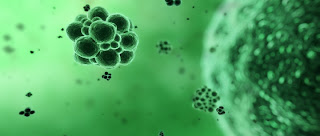
After a quick bit of experimentation, this is what I came up with:
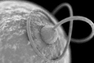
The following is a step-by-step of how it's done. Typically I would do a quick render test between each step to see how things are looking. I encourage you to go "off-script" and do some experimentation of your own -- try different settings and different materials and see what kind of results you get. The files for this tutorial can be downloaded here (3ds Max 9, and Brazil r/s 2.0).
- Setup
- File|Open... SEM_models.max
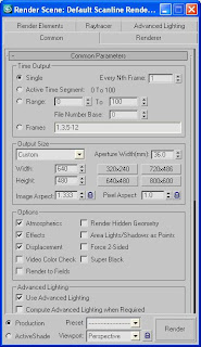
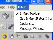
- Open the render dialog - assign Brazil 2 -- turn off the material editor lock (render/test to see what we're starting with)
- Build the first Material - bumpy with edges falling off to white
- Open the material editor (medit) - select the top left medit sphere - drag-and-drop it onto the large sphere in the scene.
- Assign a falloff map to the diffuse slot
- A quick render/test shows this is too dark, so change the front color from black to a medium gray
- It still doesn't look like we're getting what we want, so turn on skylight and do a render/test -- that looks OK, so turn skylight back off (if your computer's fast enough, keep skylight on )
Notice how skylight evens out the illumination. When working without skylight, and without lights in the scene, the light is in line with the camera, so it can be tough to judge what's really happening. Experiment with different lighting as you work to be sure that what you think you're seeing is what's really there
- Assign a Noise Map to the material's bump channel - render/test - make it fractal, 5 levels, and size 5 - set the thresholds to .2 and .8 for higher contrast in the noise.
- A quick render test shows the noise size to be too small, so increase the size to 20 and set the map amount (which controls the intensity of the bumping) from 30 to 50
- Build the Second Material - smaller bump details with edges falling off to white
- Drag-and-drop that top-left medit sphere to the next slot over, making a copy of the first material
- Drag-and-drop this second material onto the small sphere and the curly tube (torus knot)
When prompted, Rename the material (don't choose "replace"). You can rename it to anything you wish.
- Another quick render/test shows us that the bumps are too big and too intense for these smaller parts, so set the size of this Noise map to 5 and the map amount to 30
- Adjust the Camera and its Depth-Of-Field
- Select the camera, and in the command panel (modify tab), turn on DOF. Set the f-stop to 5 (smaller number = more blurry), and set focus distance so the front edge of the small sphere will be in focus (219 units is about right)
Tip: By converting the camera view to a perspective view, you can see the focus plane (colored green) in the viewport, allowing you to adjust the focus distance interactively.
- Render
- This all looks good now, so go back to the renderer panel, turn on skylight, and set the sample rate to min 0, max 1, and render.
4:20 screencap video. This follows the steps described above but has no audio. It is also scaled down quite a bit, so it may be limited use.
Critique:
This was just a quick-and-dirty approach, so there's a lot that could be improved upon. I think it has the right overall feel, but the subject matter (the model) itself could be much better and much more interesting. Some geometry hair or some type of particle scatter could add a lot of detail. If I was to spend more time on it, I might try modifying the lighting a bit -- perhaps relying on something more directional, using area lights. Once the subject matter was improved, I also might go with less DOF -- this turned out a bit too blurry for what these images typically look like. In addition to the bump mapping, I might consider using some actual displacements so that the edges of the objects aren't quite so clean.
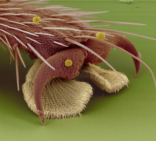
I do like the images I've seen with the false-color paint-overs, and if I was to try for something like that, it could probably be accomplished with some simple coloring in the materials themselves, and in that case, some GI might give some neat blending/bleeding. Here's an example of a really well done paint-over of a real scan -- you can see how some GI might work well in a case like this:
Conclusion:
Keep in mind: This is just one approach -- there are many directions that this could have gone, and many advanced features, like GI, subsurface scattering, and displacements, that may be useful for achieving the desired look. There are no rules for this stuff, so experiment, have fun, and keep the goals in mind.
As an example of another approach, the following image used area lights and subsurface scattering to get the edges of the cube right (the inset image is the original reference picture, the larger picture is a Brazil rendering):
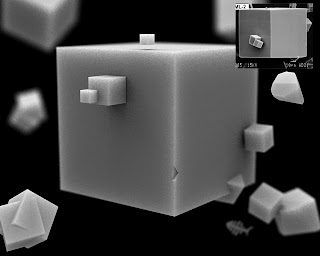
images: cubes - Josh, flyfoot - unknown


